Canvas is a learning management system (LMS) used by the University of Washington (UW) for professors to share course material and grade assignments. For students it provides a platform for viewing and submitting assignments, as well as collaboration between students, through discussion posts, chat, etc.
The goal of this redesign was to investigate current issues students have with the site, and then ideate potential solutions, which will then be prototyped and tested for feedback. After an iteration of testing, a high fidelity prototype will be created.
3 months
Visual Design
UI Design
Prototyping
Usability Testing
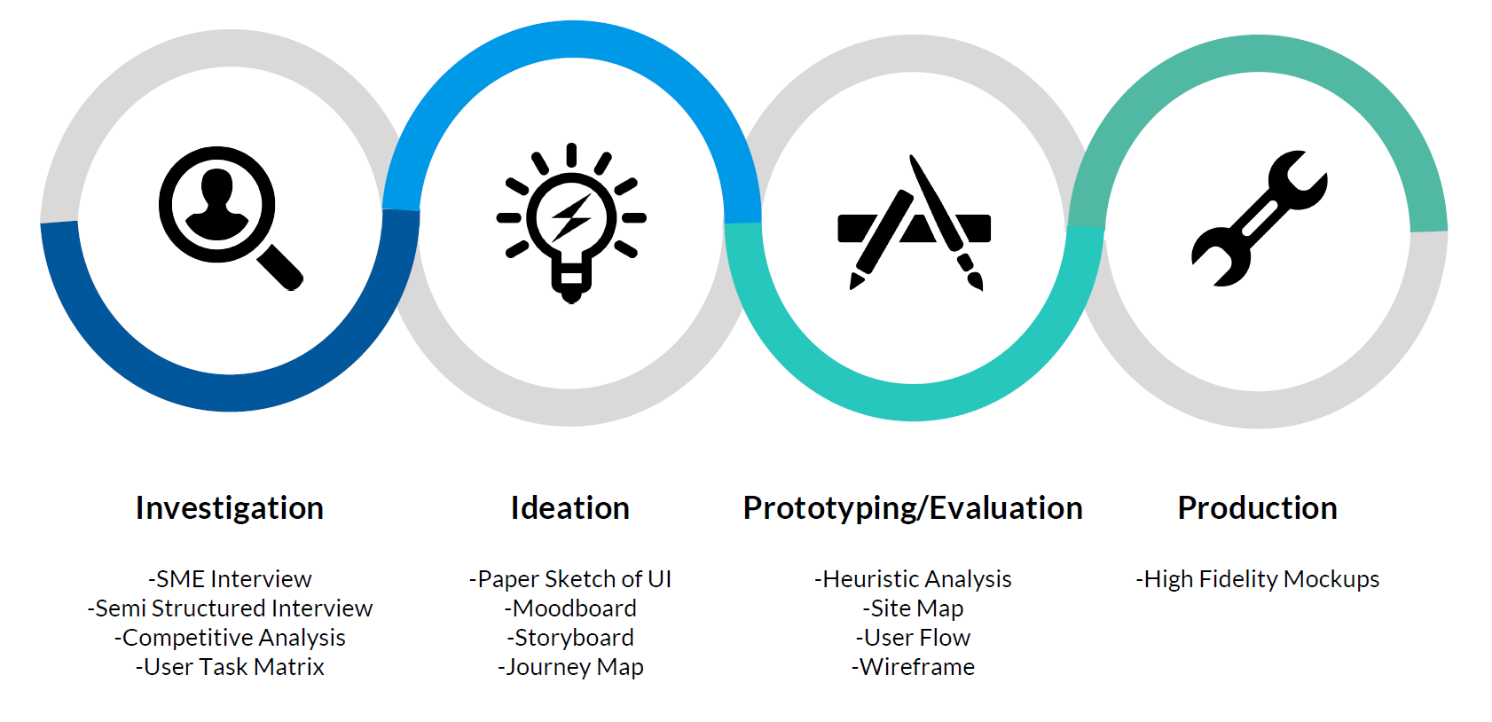
The design process for this project follows the user centered design process which consists of four stages: Investigation, Ideation, Prototyping/Evaluation, and Production. Several design artifacts were also generated which can be found in the diagram below.
To investigate user's issues with Canvas, several research methods were conducted. This consisted of both primary and secondary research to understand the current landscape for Learning Management System (LMS) tools. The first step was conducting a user interview with Tyler Fox, an instructional technology that supports Canvas at the University of Washington.

Tyler Fox, Canvas SME
He identified three key challenges with the current Canvas system:
1. Lack of Customization - Instructors are unable to customize the UI. This is to allow students to transition easily from one course to another, since the format is the same.
2. Parity across Devices - There is a lack of uniformity across the different platforms of Canvas, so it takes longer to learn.
3. Slack Functionality - Although Canvas has communication functionality built in, its discussion board lacks the visuals and ease of use that a Slack channel provides.
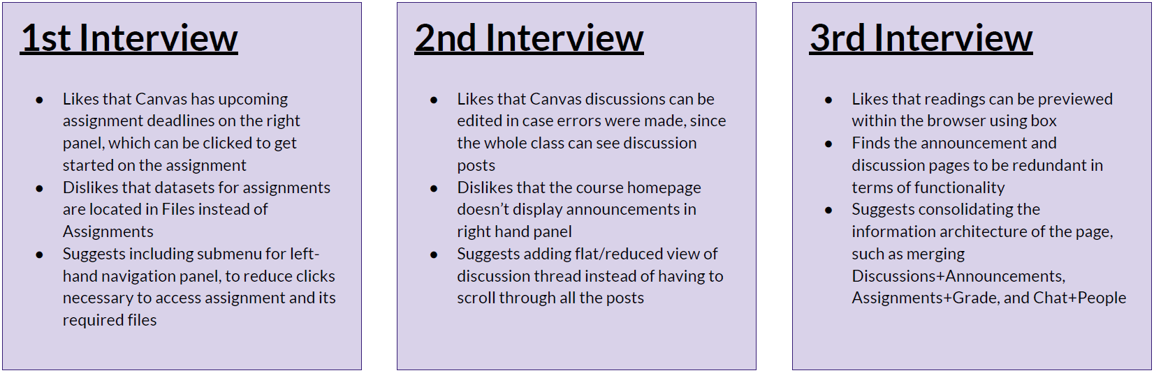
The second part of the primary research was conducting semi-structured interviews with UW students across all grades (Undergrad, Masters, PHD). The students came from different backgrounds including Computational Finance, Biology, and Information Science.
Next was conducting the secondary research, which consisted of a Competitive Analysis and User Task Matrix. The criteria for the competitive analysis was determined by looking at past competitive analysis done by UW provided by our SME, and evaluating them across the competing LMS tools (Canvas, Blackboard, Catalyst, Slack).
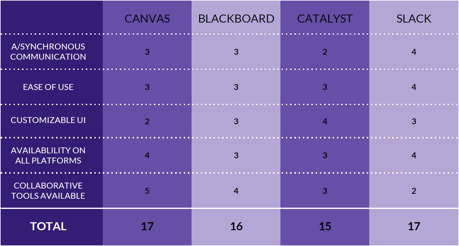
From the Competitive Analysis, I found that Canvas scored lowest in Ease of Use and Customizable UI, which lined up with the 1st challenge identified by our SME.
The criteria for the user task matrix was determined by looking at commonly completed tasks identified in the semi-structured interviews, and evaluating them across multiple platforms (mobile, tablet, desktop).
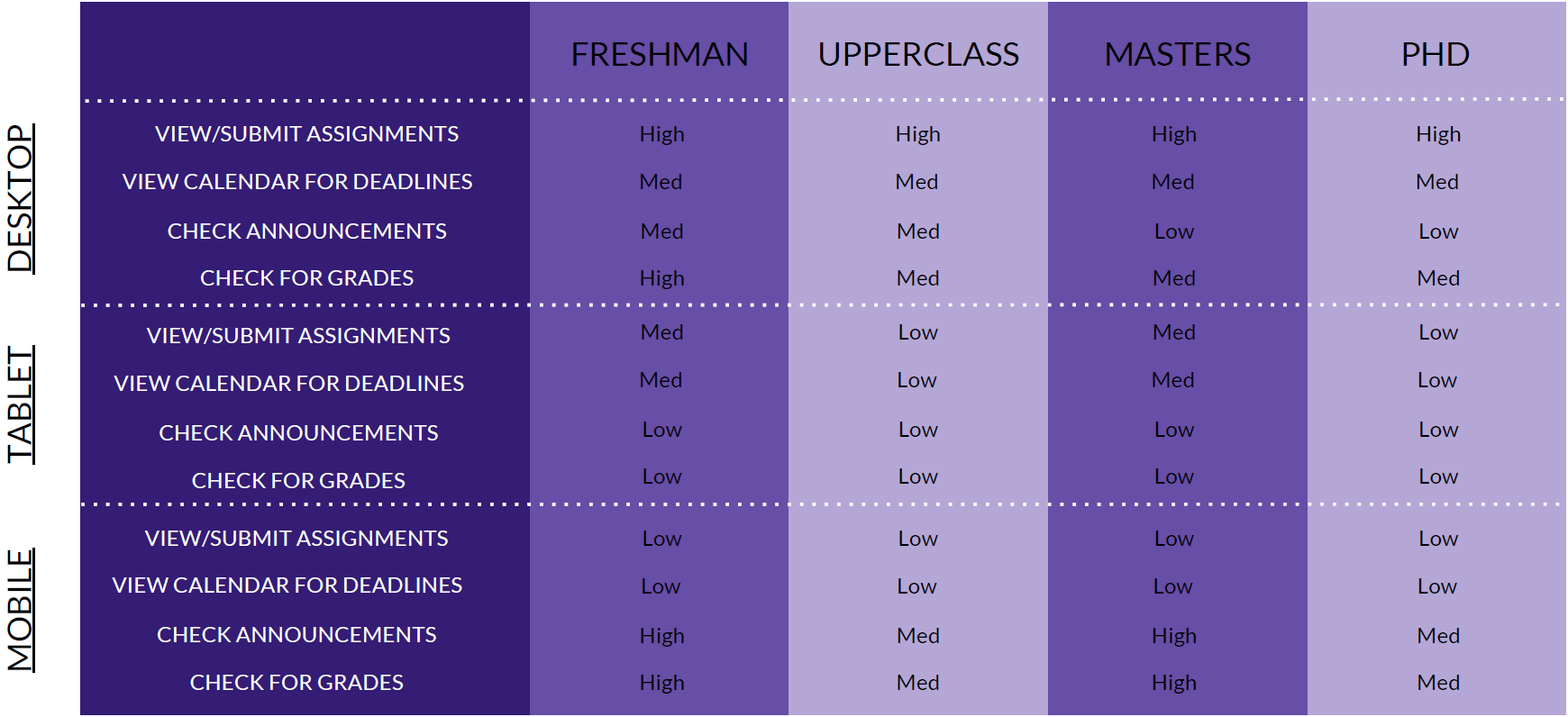
From the User Task Matrix, the most commonly used platform for Canvas was the desktop, and this remained the same across all grades as well.
To generate potential concepts for Canvas, several ideation methods were conducted. The first method was low fidelity sketches using paper to convey ideas. Based on the investigation in the first phase, I decided to focus on making the UI more customizable and easier to use.
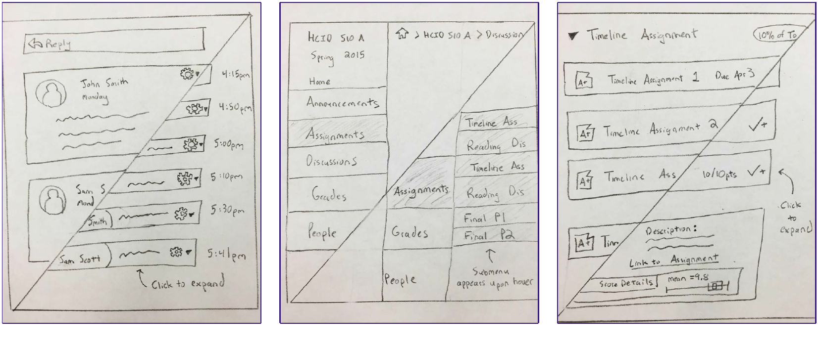
Redesign of the discussion thread, navigation panel, and assignments page
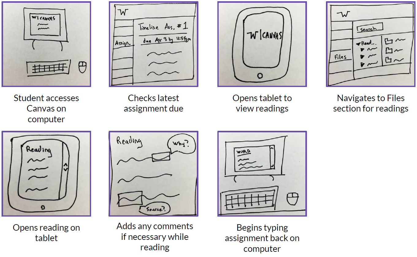
I also explored some of the concepts further by creating a storyboard of a hypothetical scenario, where a student may need to switch between their computer and laptop while working on an assignment.
The next ideation method was creating a moodboard, to understand the emotion that the redesign should evoke. The focus was on creating an enjoyable experience that was not stressful when trying to complete assignments.

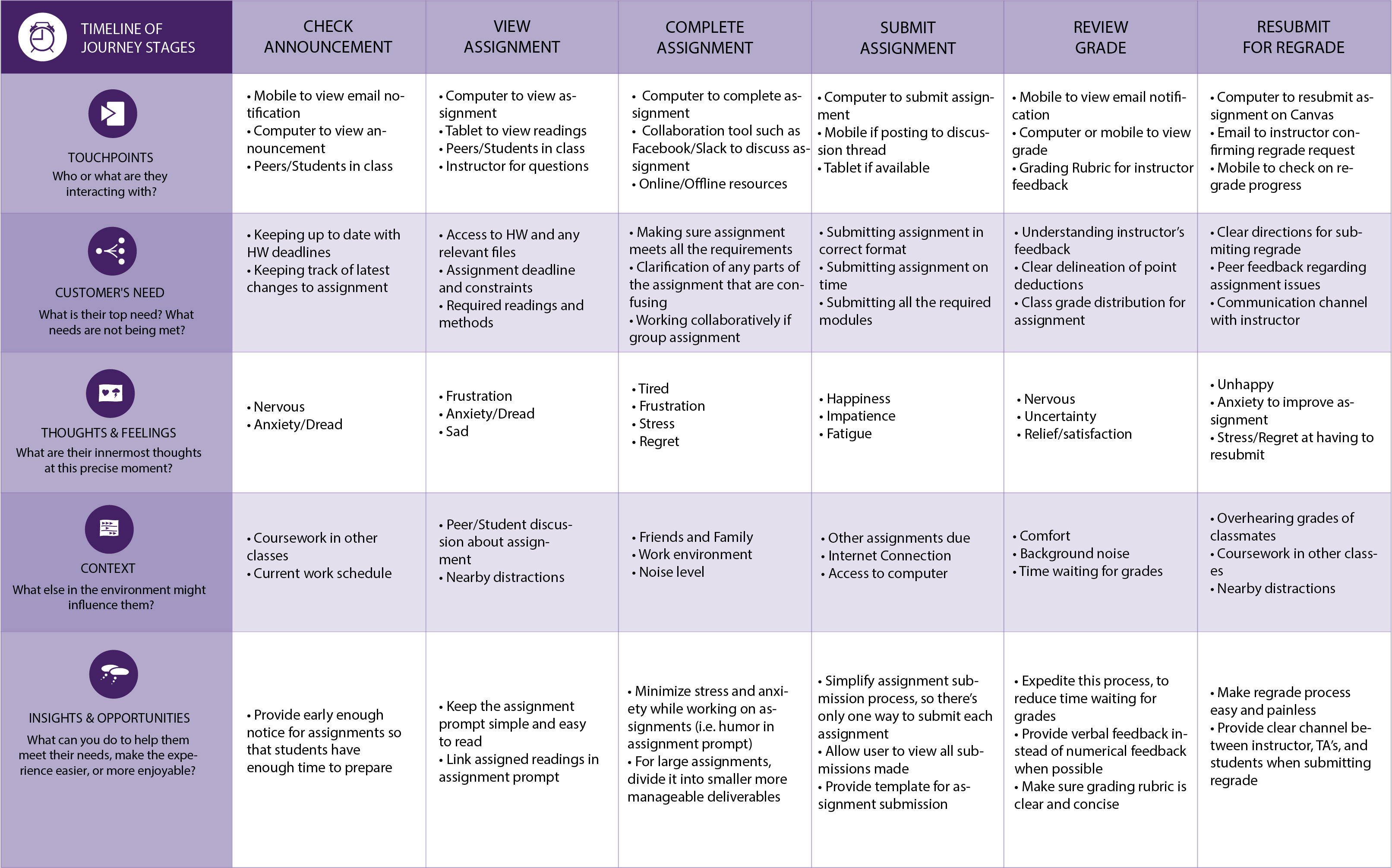
Finally, a journey map was created to map out the student's experience with the Canvas assignment submission process. Touchpoints and user need's were captured along with any insights or opportunities for improvement.
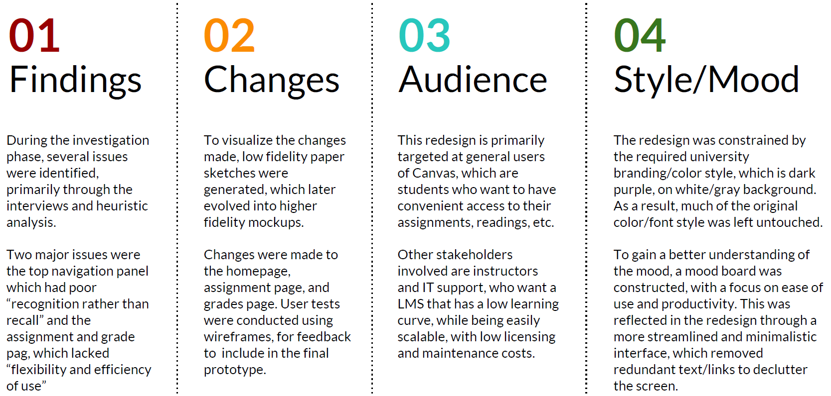
From the investigation and ideation phase, I narrowed down the scope, with a target of revamping the navigation panel and the assignment/grade pages. For the next phase, I first conducted a heuristic analysis following Nielsen's 10 heuristics to determine usability issues.
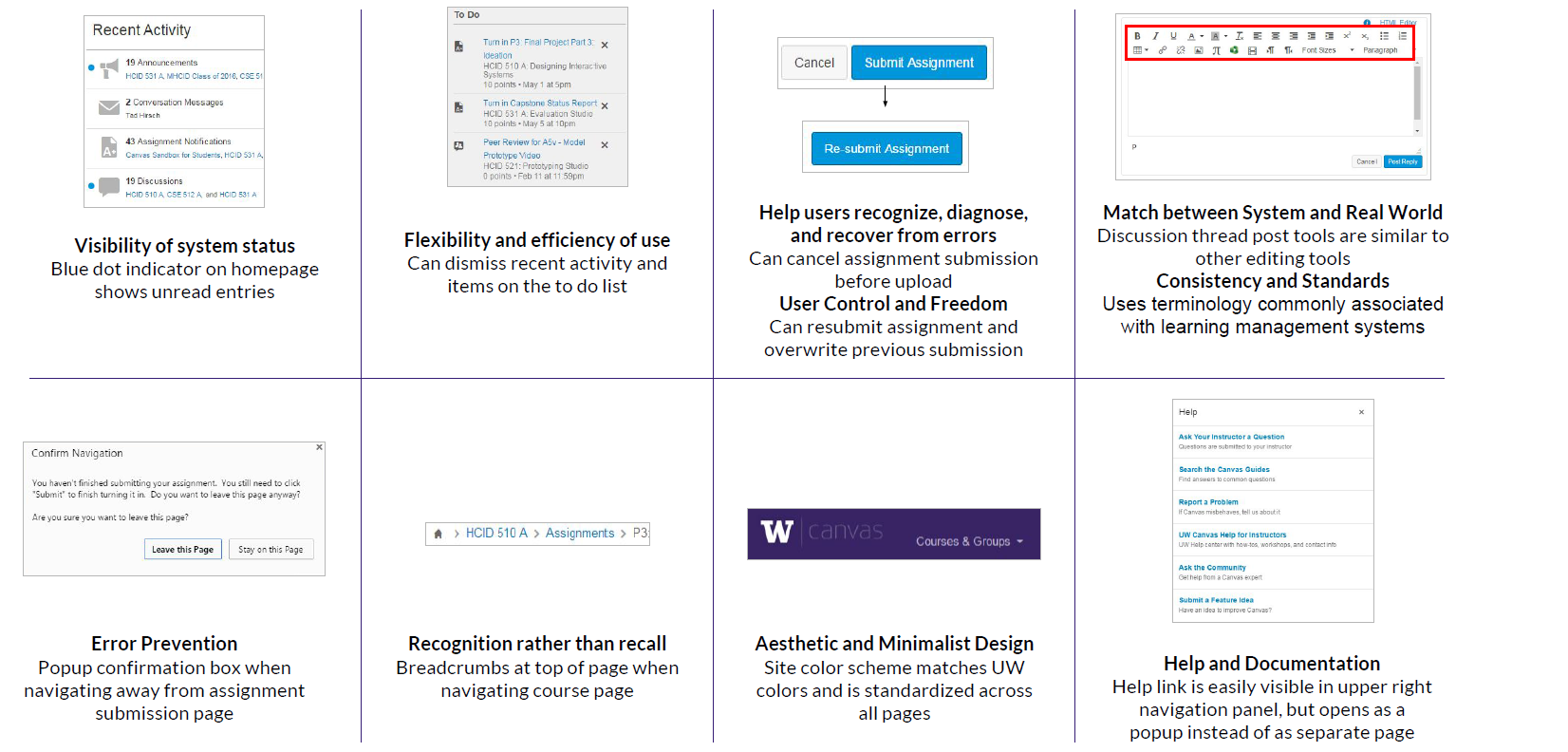
The two heuristics that seemed to need the most improvement were "recognition rather than recall" and "flexibility and efficiency of use."
After the heuristic analysis, I built a sitemap and user flow chart to better understand the information architecture of the site. The sitemap helped identify the linkage between pages and if anything could be improved by combining pages or adding new connections.
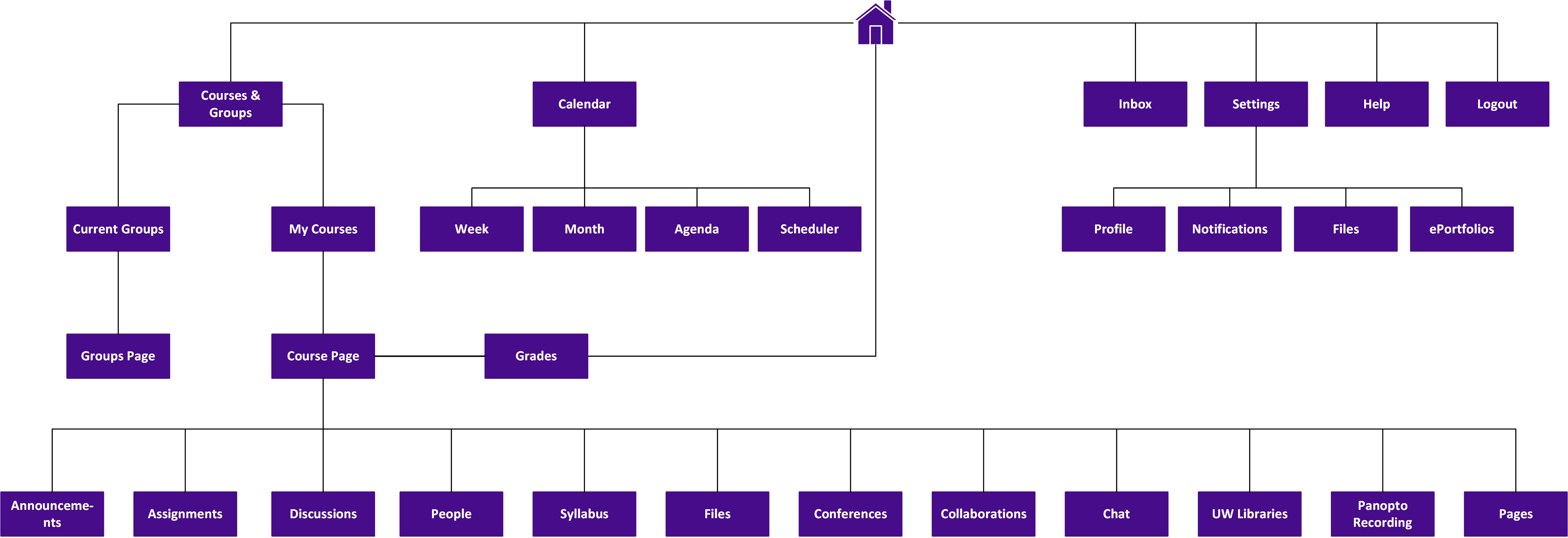
I discovered that that many pages required 2-3 clicks to get to, especially if they were within the course page. This could be improved to 1-2 clicks by adding better linkage in the navigation panel.
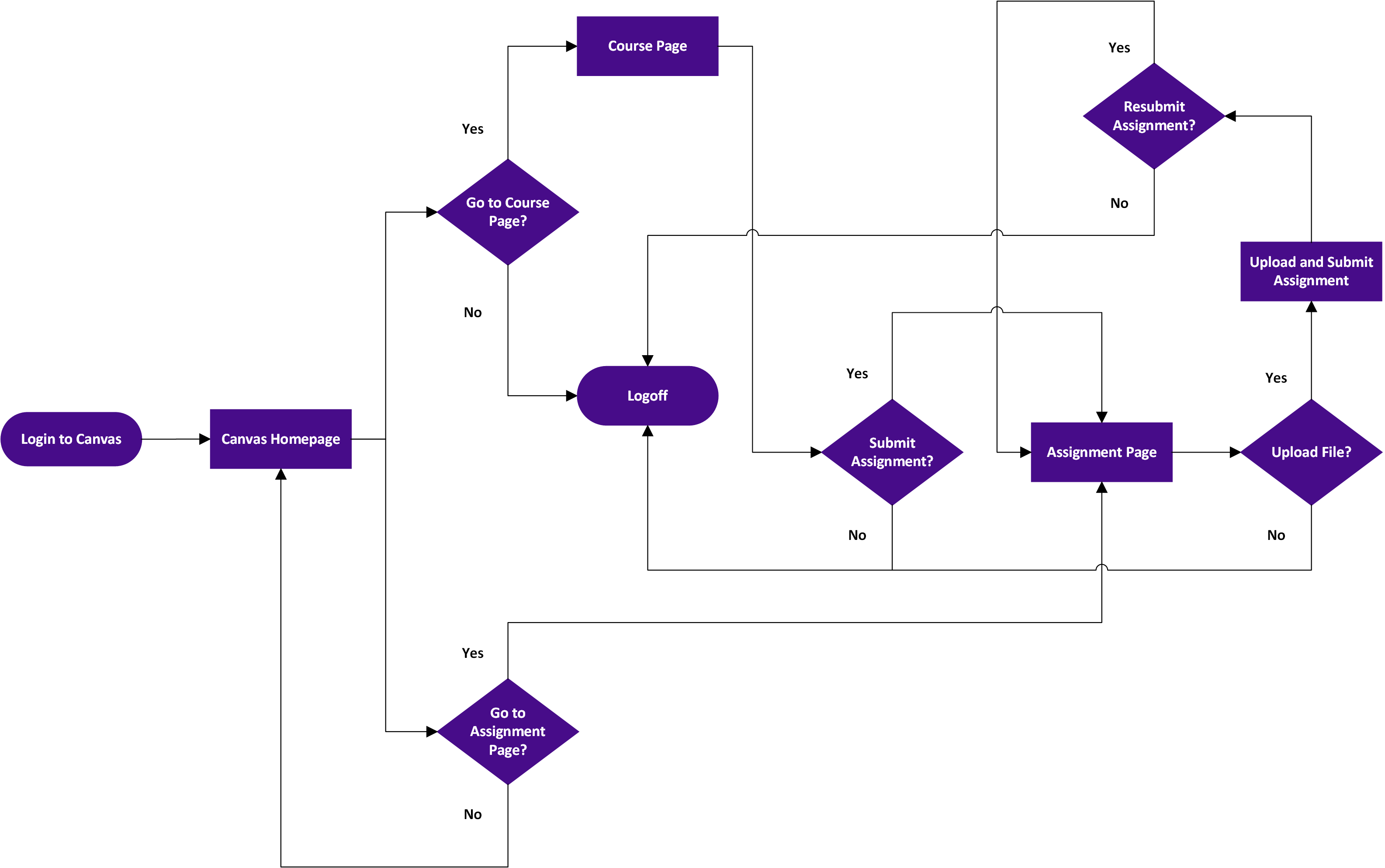
For the user flow chart I focused on the assignment submission flow, using the journey map and sitemap for reference.
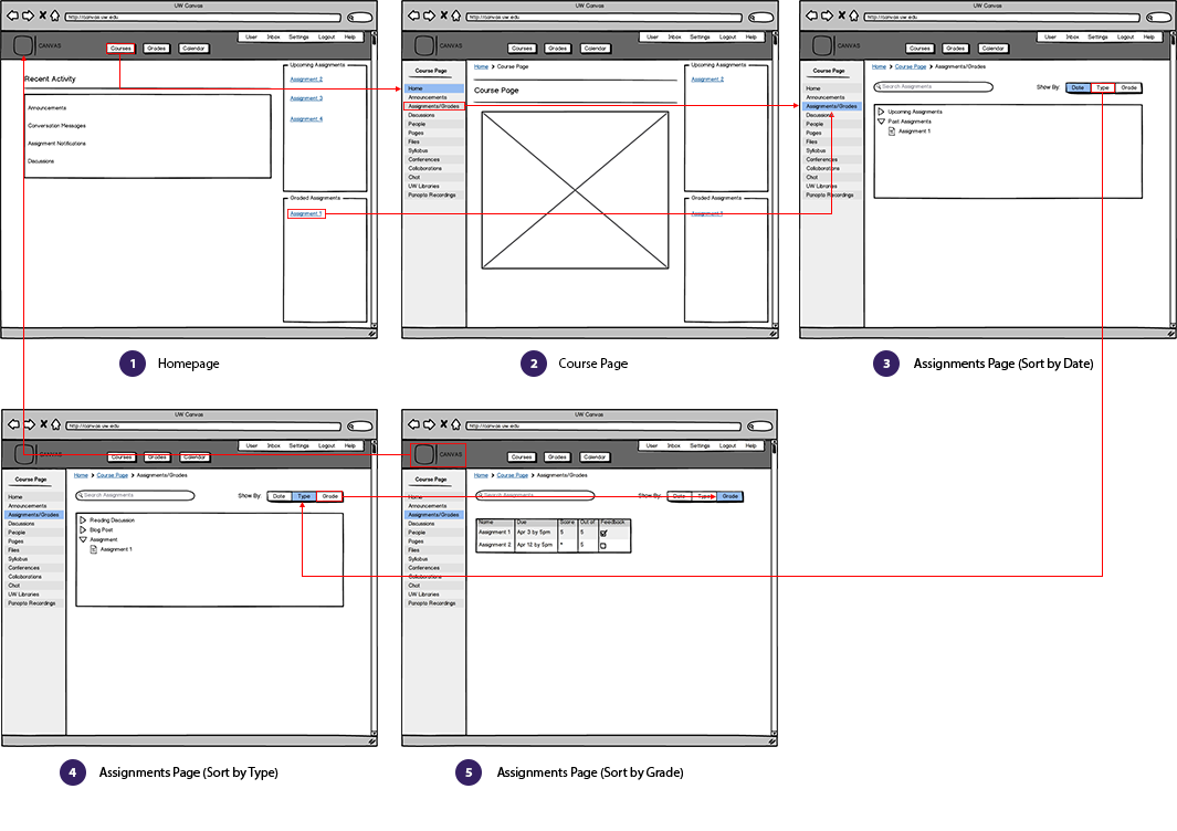
The last step of this stage was creating a low-fidelity prototype to get user feedback before creating the high-fidelity prototype. The wireframes focused on the task of students accessing the Canvas assignment page, where they can view upcoming and past assignments, as well as their grades.
I used Basalmiq to create low-fidelity wireframes, focusing on using as little color as possible, to avoid influencing the user. Then I linked the wireframes using Invision to create a clickable prototype.
After creating the prototype, I conducted a user test to evaluate the proposed redesign. Users were recruited from UW, and were required to be current students who have used Canvas before. The test was conducted in a campus/cafe setting, where users would feel comfortable providing feedback.
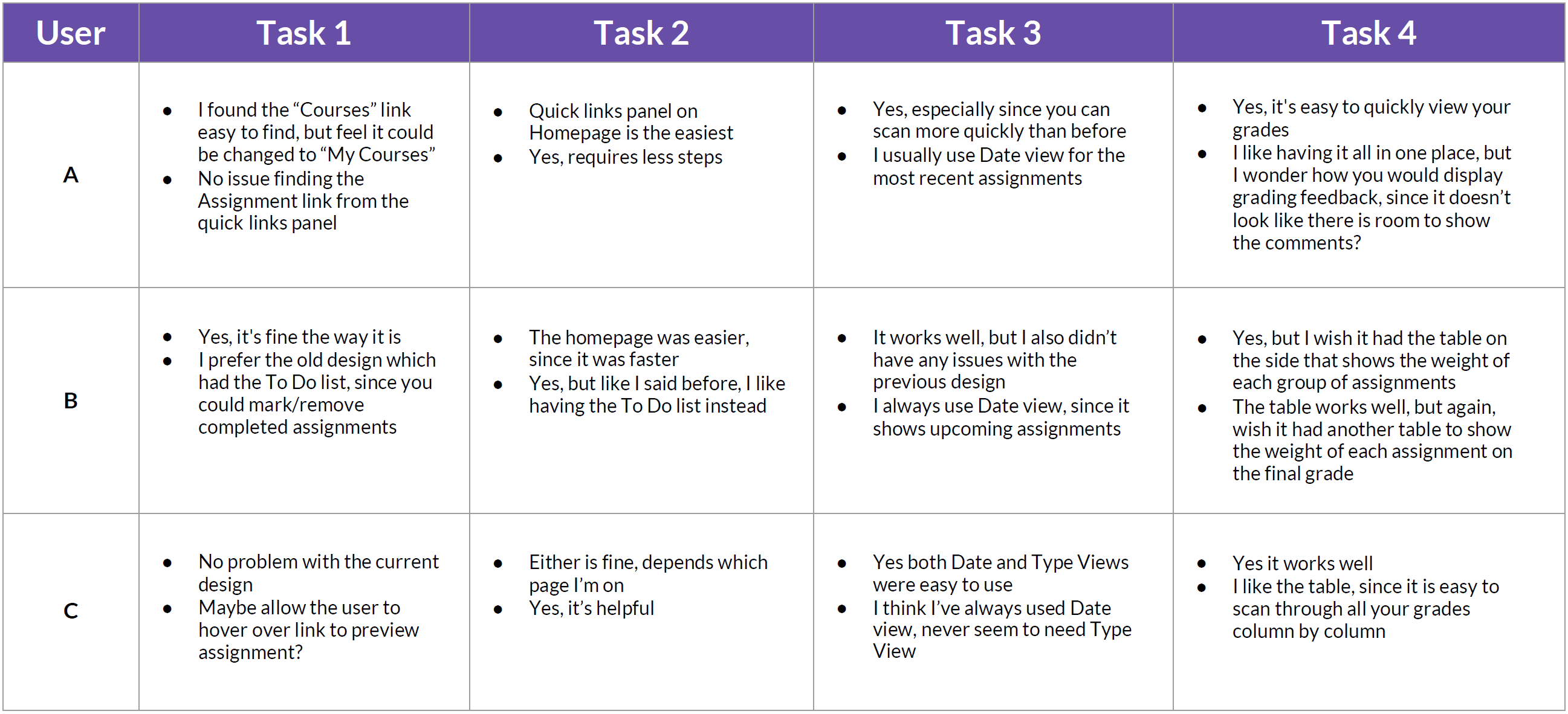
Below is a summary of the test process. It was timed to take about 30 minutes. Users were first asked some demographic questions. After completing each task, several follow up questions were asked. The full test script can be found in the appendix section of the process book.
1. Introduction (1 min)
2. Background Info (3 min)
3. Canvas Usage (3 min)
4. Task #1: Navigating to the Assignments page from Homepage (6 minutes)
5. Task #2: Navigating to the Assignments page from Coursepage (6 minutes)
6. Task #3: Viewing Assignments by Date/Type (6 minutes)
7. Task #4: Viewing Assignments by Grade (6 minutes)
According to the user test, changes to the homepage and coursepage worked well across all users. Some were fine with existing design, but expressed that the new design was an improvement. For the grades page, some users wished for additional information to be displayed due to the multitude of information available.
Another concern was the ability to expand feedback similar to the original threaded design. Potential solutions would be displaying a popup upon clicking the feedback check mark or implementing accordions in the table.
Based on the feedback received from the user tests and the insights gained from the first three stages, I built a high fidelity interactive prototype using Axure. A link to the prototype can be found at the top of the page.

A possible next step is to branch the redesign into the tablet space. The current Canvas app on tablet lacks many of the features available on the desktop version. Perhaps many of the changes made in this redesign could be ported or translated over. You can find a summary of the UI exploration below.