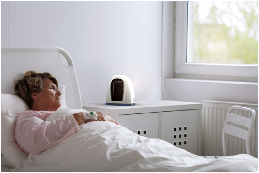
Patients can feel isolated from their loved ones while in the hospital. Nausea, pain, and reduced mobility can all impair their ability to use mobile technology. If the patient has an infectious disease, their cell phones can spread this and infect others.
Convey is a phone dock that helps patients communicate with their loved ones by providing them a form that is easy to touch with a voice controlled interface to make and receive calls. Convey allows users of varying abilities to easily communicate through a simple user interface, touch input, and voice commands.
Pandemics are a growing concern in an increasingly connected world. One of the largest pandemics, was Ebola in 2014, which affected several countries in Africa. Unfortunately at the time, many organizations and countries like the World Health Organization(WHO) and the United States did not take the issue seriously, leading to a very slow response.
For this project, my team consisting of 4 designers focused on exploring solutions for a hypothetical Ebola Pandemic in Walla Walla, WA, which is located in a rural area and may not have the same level of resources as a hospital in a major city.
The design process for this project began with user research to understand the key problems, followed by ideation to generate concepts, and then concluding with prototyping and testing to evaluate the final concept. I was responsible for leading the prototyping/testing phase, building the prototypes and interactions in both 2D and 3D space, along with conducting the user testing. For the user research and ideation phases, I worked collaboratively with the other designers to investigate the problem space and come up with potential concepts.

In order to better understand the problem space, we interviewed a subject matter expert, Dr. Phil Green, who specializes in Emergency Medicine and works in Walla Walla, Washington. In addition, he is also the pandemic response coordinator for parts of Oregon and Washington and has written a book called "Trauma Room Two". He identified several key problems that needed to be solved.
1. People diagnosed with Ebola may not be able to see or move due to blood in their eyes, vomiting, diarrhea, etc. Designs should be multimodal to account for loss of certain senses.
2. Anything an Ebola patient touches must be incinerated, so any design that comes into contact with a patient must be low-cost, disposable, or contamination proof.
3. Patients sent to quarantine need a meaningful way to keep in contact with family or loved ones, as they will be extremely stressed, and need someone who can reassure them.

Dr. Philip Allen Green
Based on the feedback from our SME, we developed 3 different personas, representing our target users across different population segments found in Walla Walla. These include the standard citizen, the student, and the elderly.
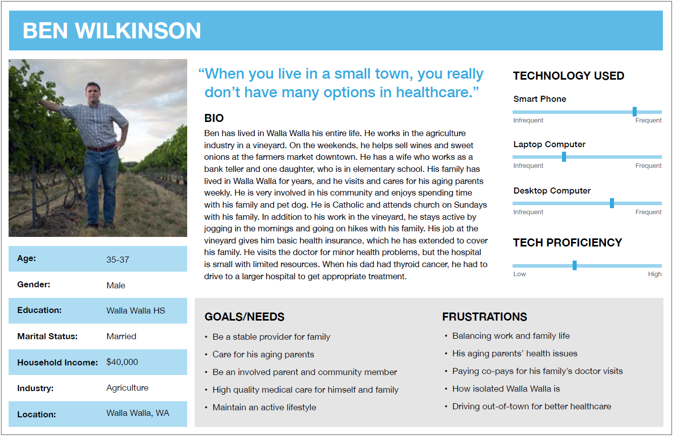
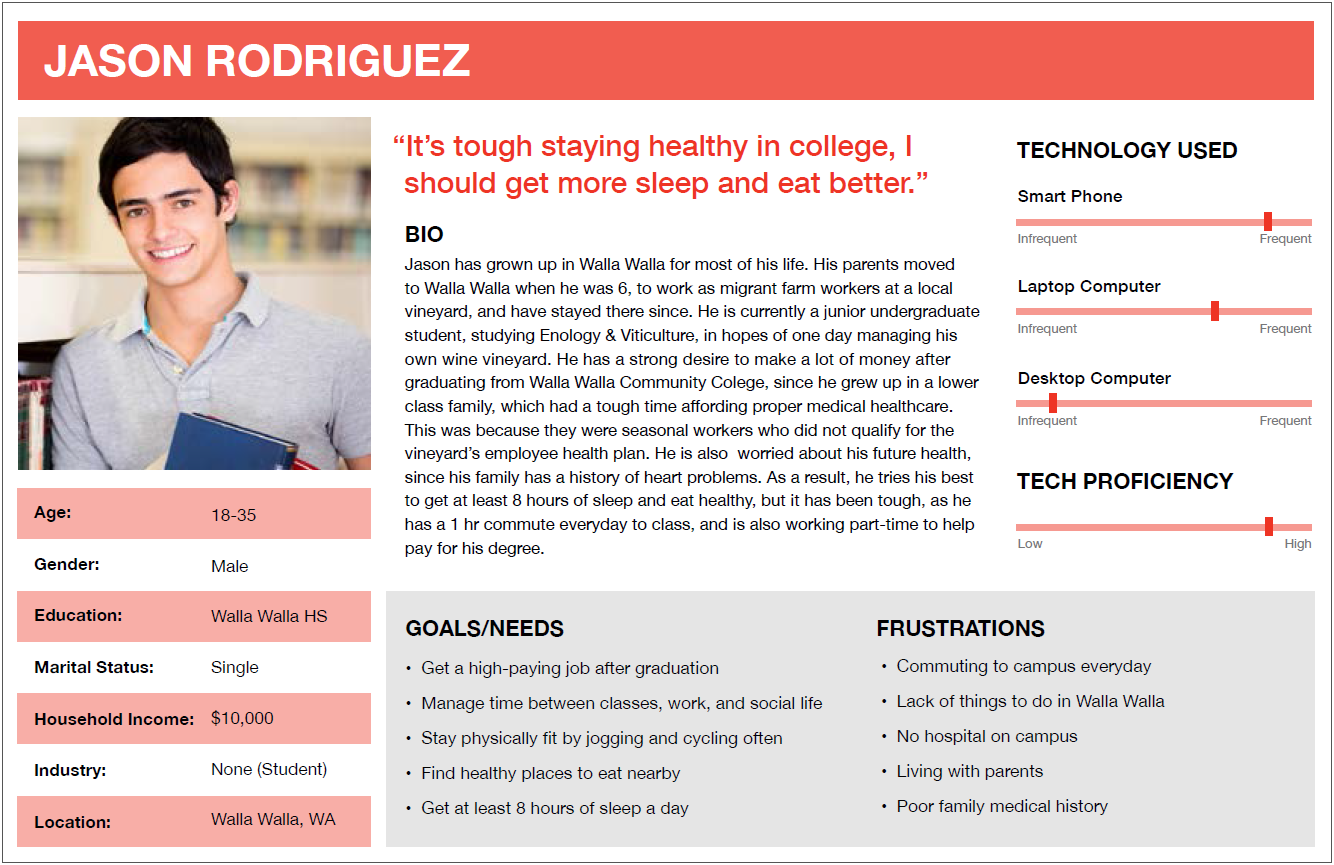
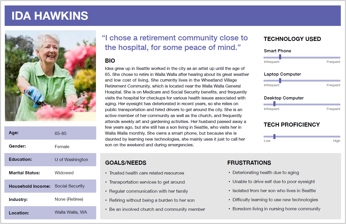
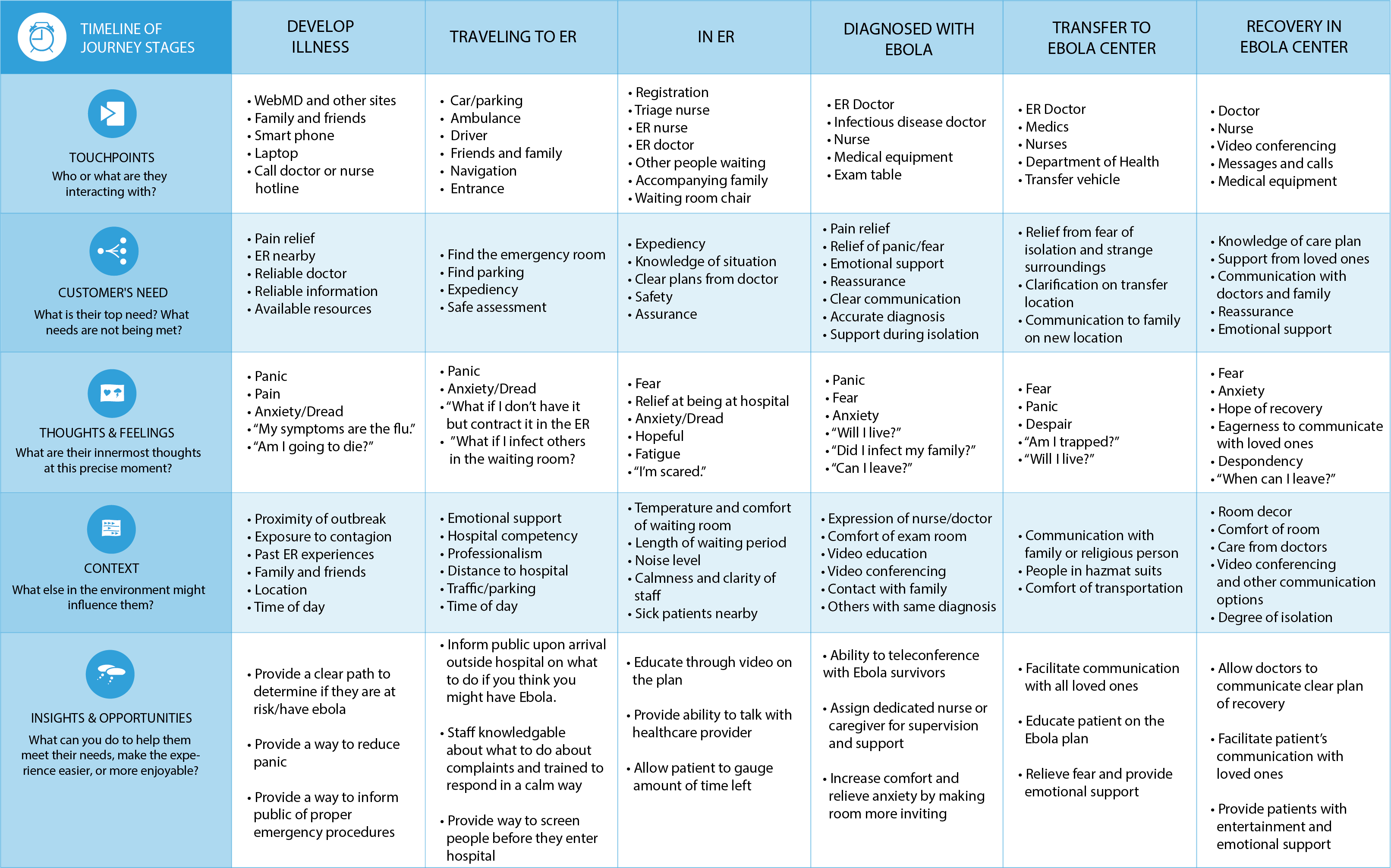
We also built a Journey Map of the Hospital Visit, which was used to map the step by step activities of a patient visiting a hospital. This helps take into account the character's internal thoughts and external influencers, which can then be used to identify opportunities.
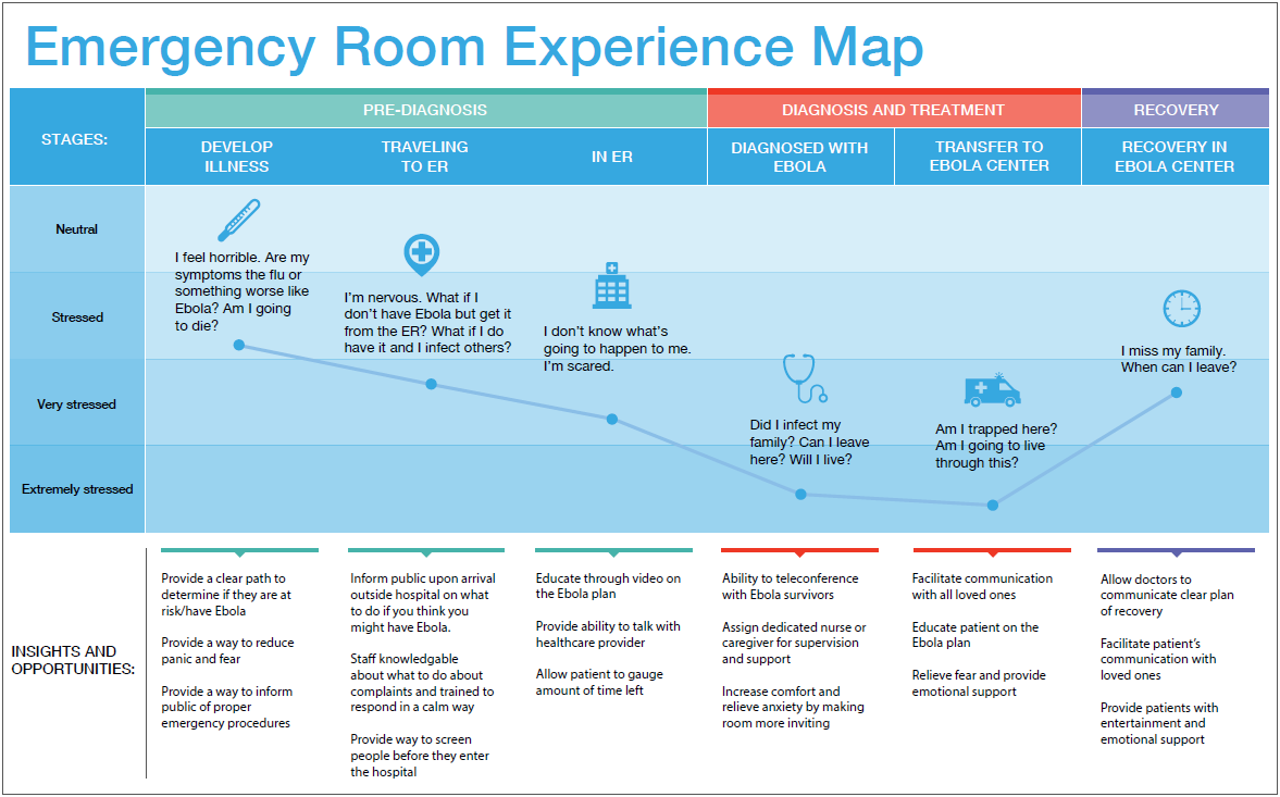
An Experience Map was created based on the Journey Map, serving as a visual representation through a combination of visuals and text to illustrate the users' flow within a hospital, as well as their needs and touchpoints.
A moodboard was created to visually illustrate the emotions we wished to elicit from hospital patients. It centers around making patients and their families happy while visiting a hospital, through hospital staff you can trust.

Based on the user research, we began the ideation phase, which consisted of sketching low-fidelity mockups of potential concepts. We eventually narrowed down the original 50 concepts to 6 through several voting sessions, where we debated the best concepts and put a star next to the top 6.
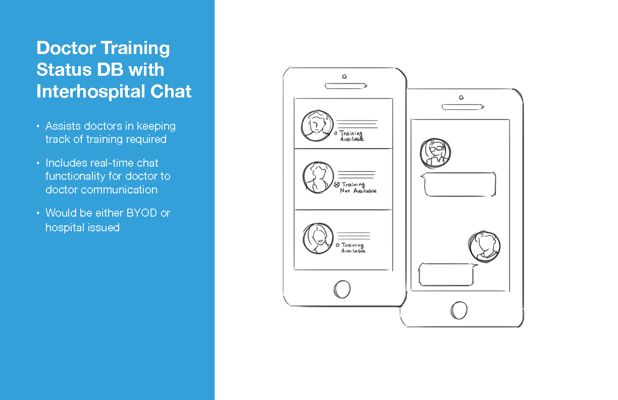
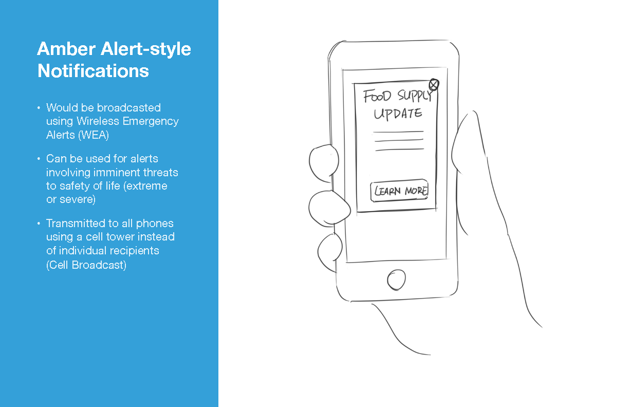
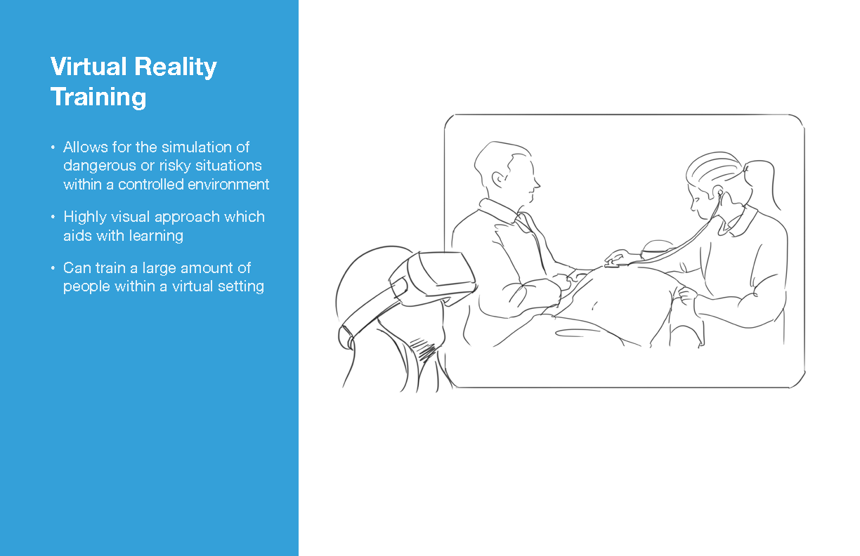
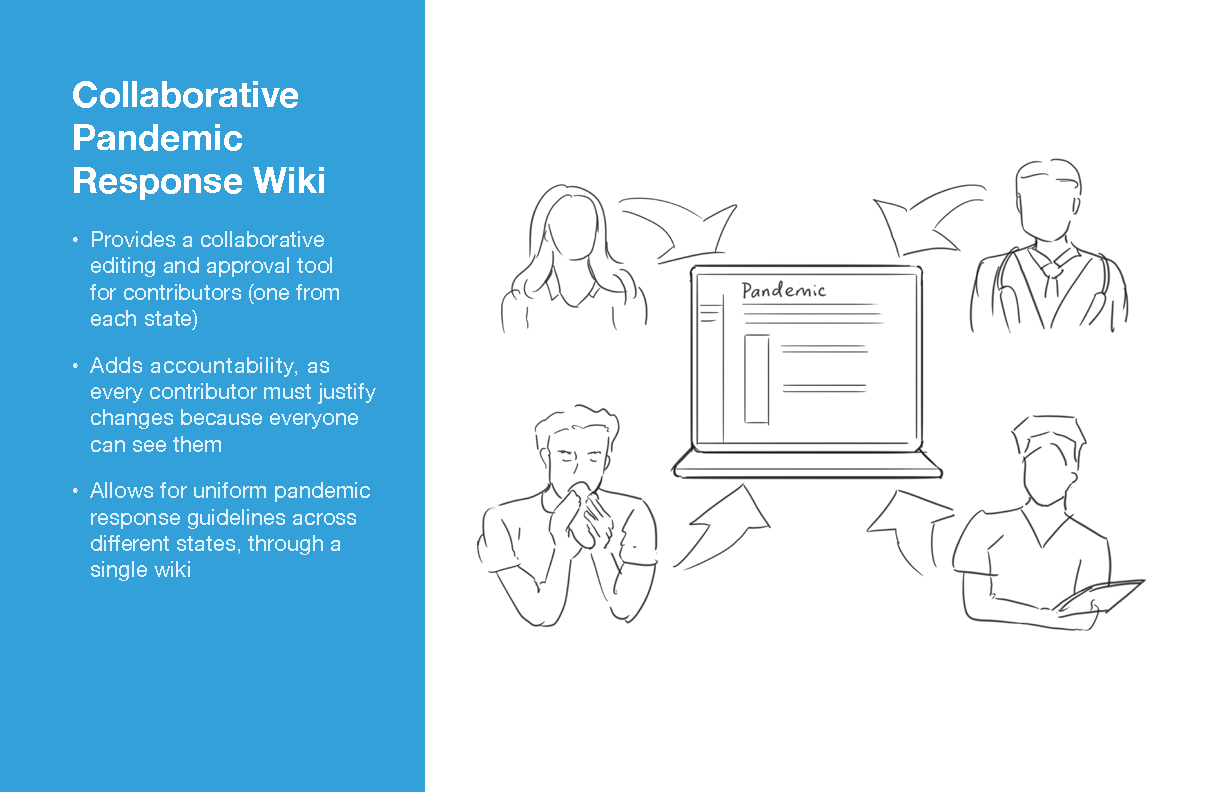
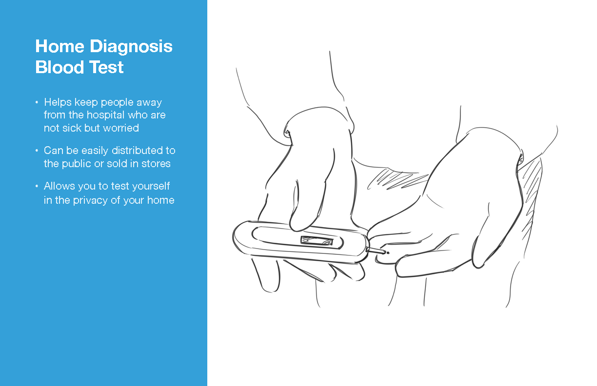
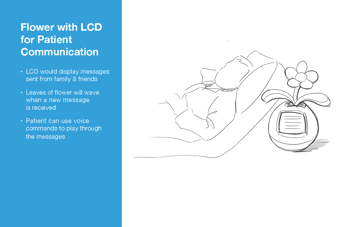
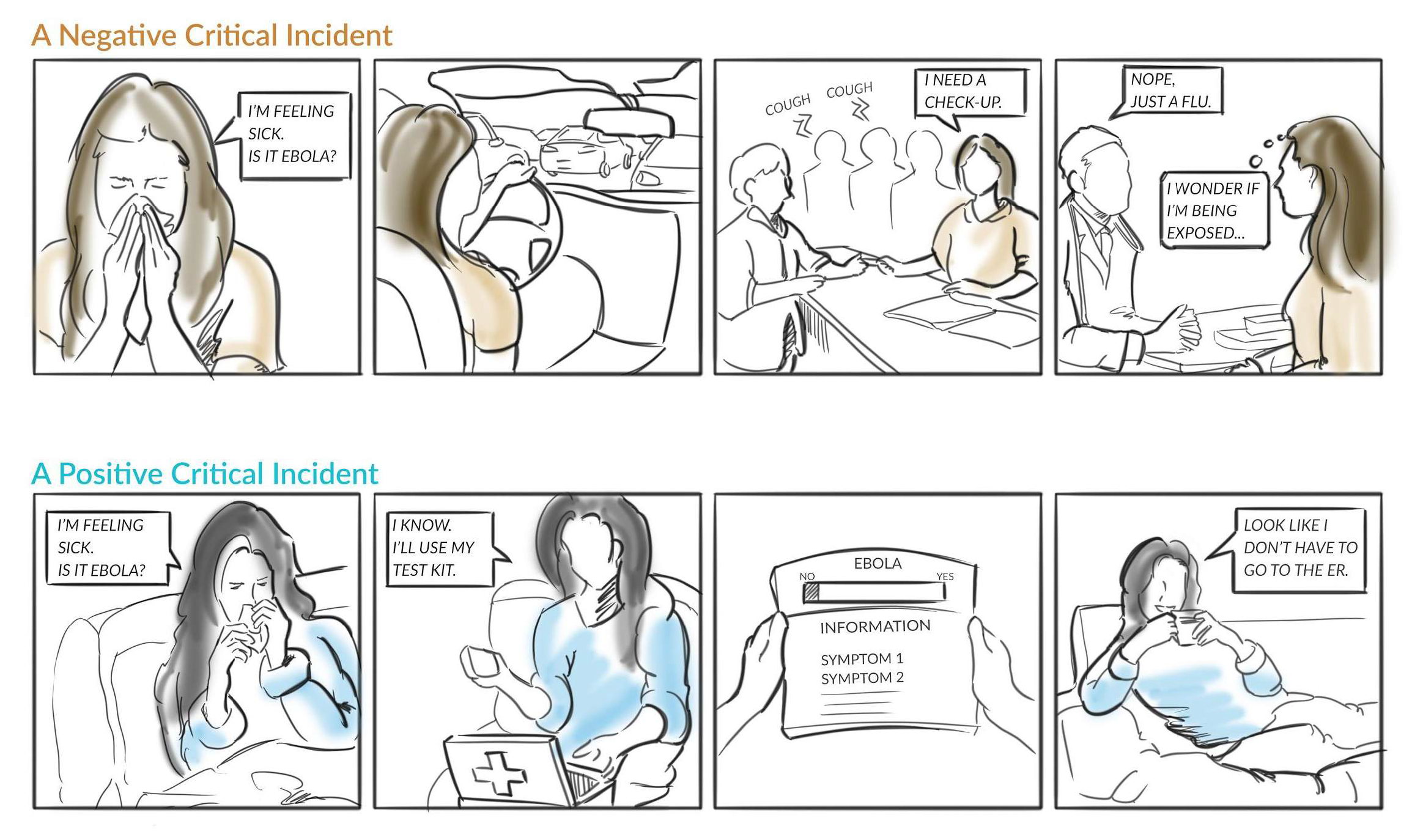
We chose to create a Critical Path for one of our concepts, which illustrates a positive and negative path a user can face when using our concept. Then we used the Experience Map to determine which stage of the hospital visit the branching path may occur. For the Home Blood Test Kit, the branching path occurs during the first stage, while the user is still at home.
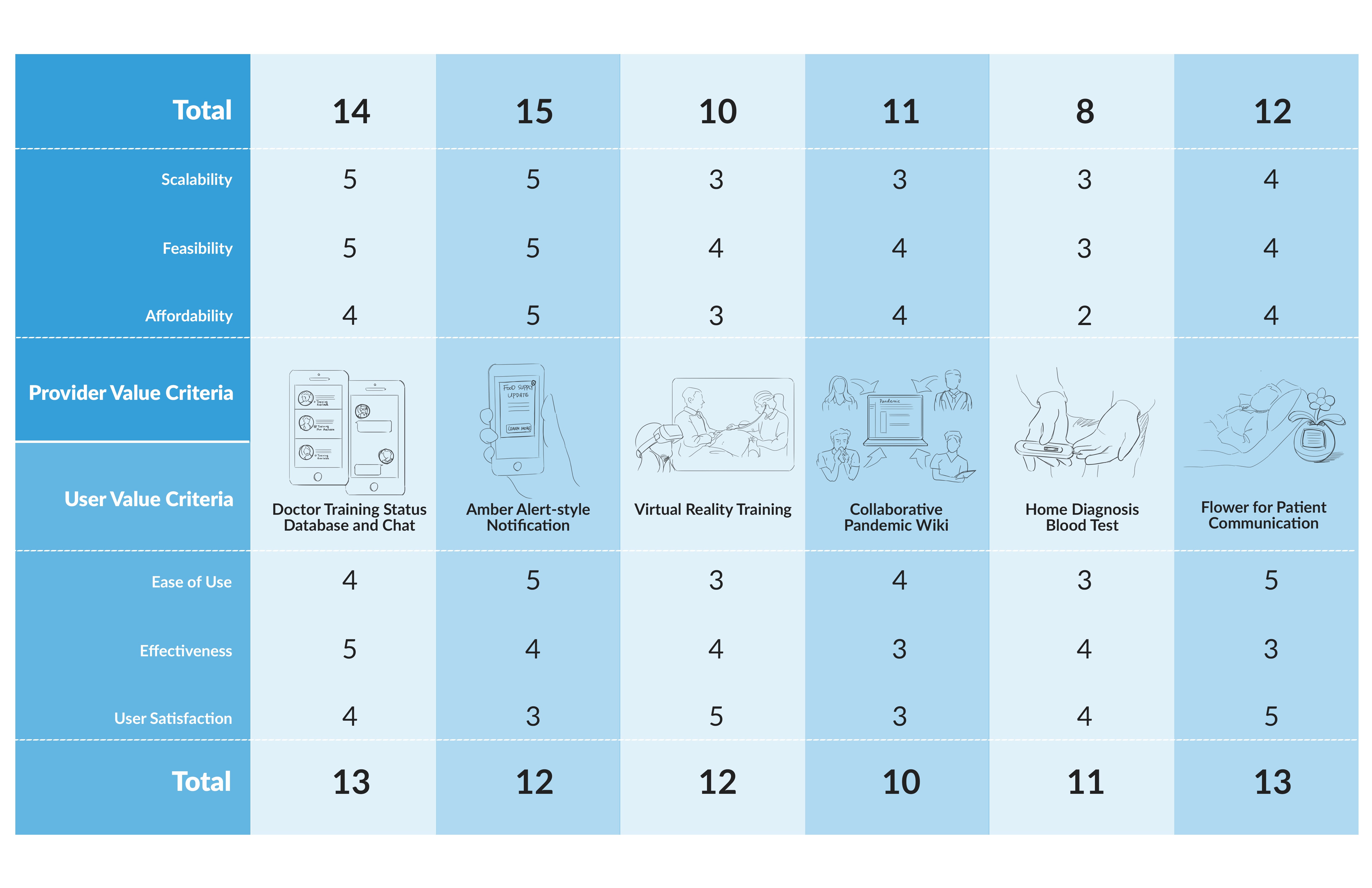
After selecting 6 concepts through team discussion, we brainstormed six different values to evaluate each concept. The evaluation metrics were divided into two groups, one for users (patients), and the other for providers (doctors). This was then mapped to a Concept Evaluation Matrix.
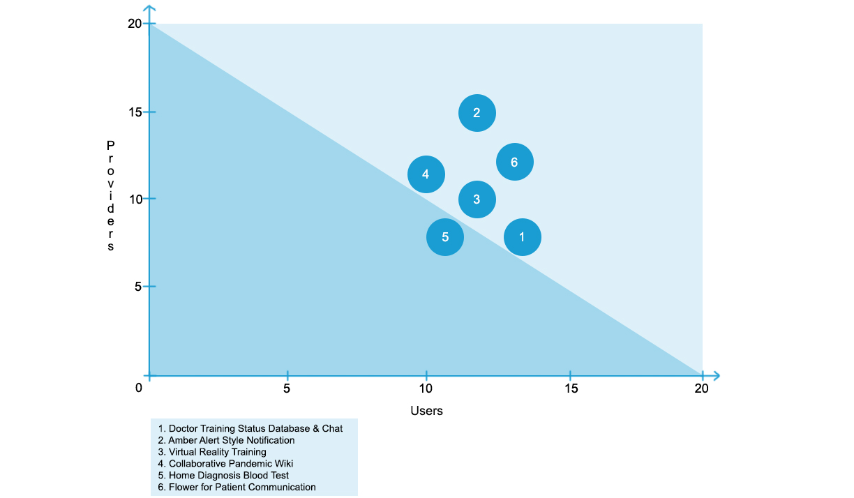
The Concept Evaluation Plot was generated based on the Matrix, to help divide the concepts based on whether they were strong for boht users and providers, which is ideal. The triangle was created by drawing a line from the highest Provider and user scores.
We chose to change our original idea of a Communication Flower to a Snowglobe Phone Dock, based on peer feedback we received. By replacing it with a phone dock, two-way communication was now possible, which was a major drawback for the flower idea, as it only allowed one-way radio communction. It was also much more affordable, which helped improve the concept's value for providers.
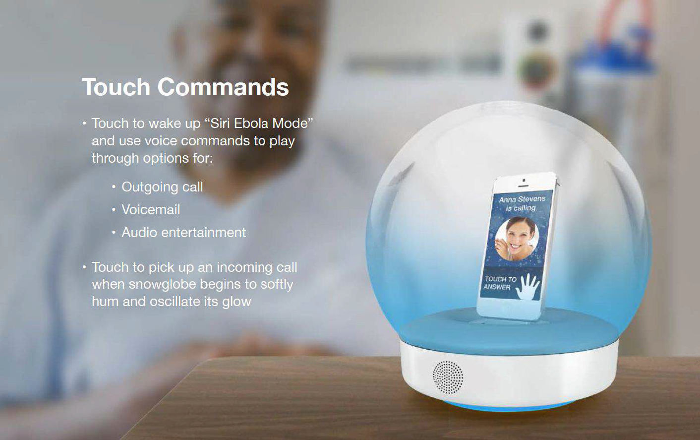
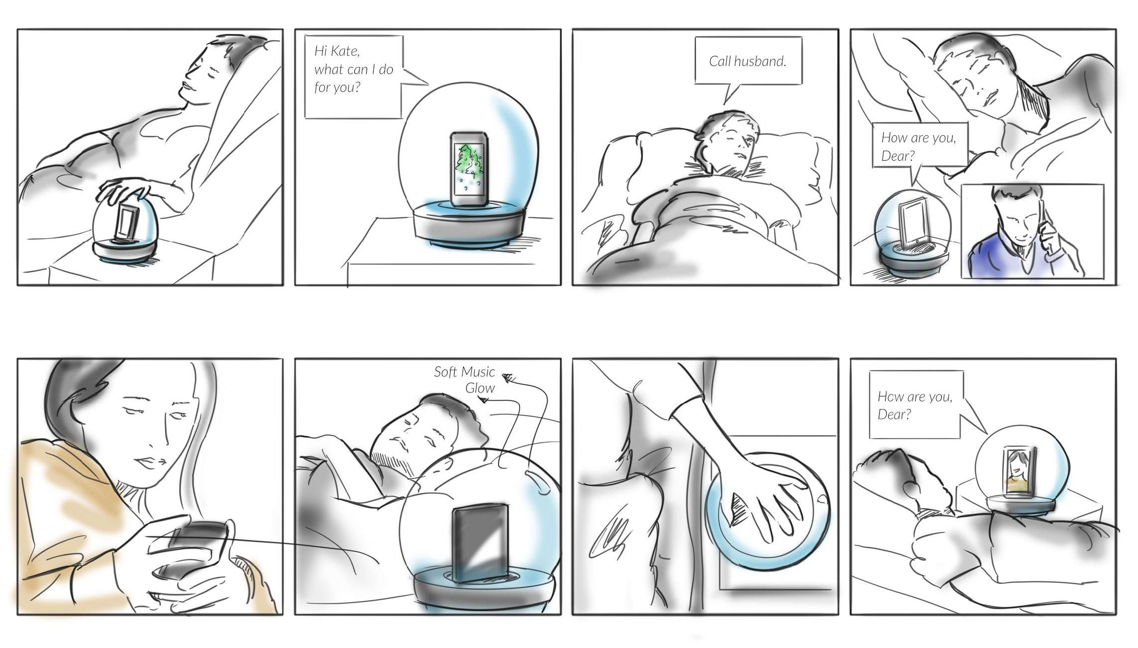
Ultimately, we decided on the Snowglobe Phone Dock for our final concept, based on the final score using the concept evaluation matrix and plot. We also felt it served patient's needs best, when they have been separated from their family for an extended period of time. We created a storyboard of the final concept illustrating the importance that patients have something in their room, that lets the family communicate with them from afar.
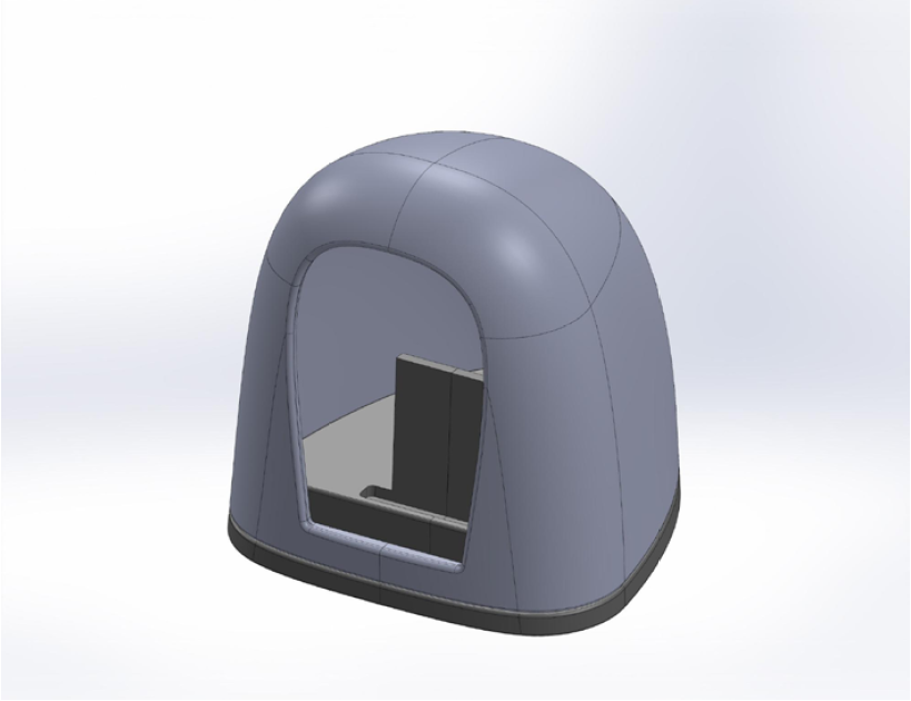
When we decided on building a prototype of our pandemic proposed smartphone dock, we chose to focus on the look and feel of the prototoype. As a result, we chose to model our prototype in the 3D space, using 3D printing as a means to allow the user to touch our design. It also allowed for ambient visual feedback, through the glow of LEDs in the translucent plastic.
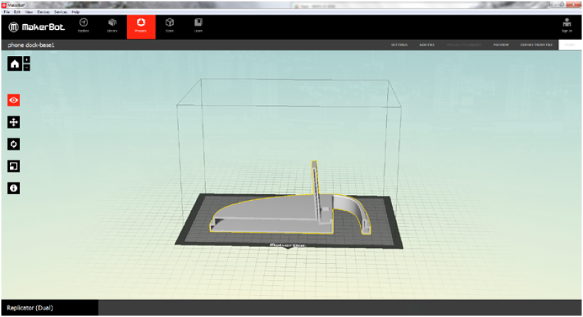
The concept was first modeled using SolidWorks, and then transferred to Makerbot Desktop as a STL file in order to print with a Flashforge Pro 3D printer. We chose to split the model into multiple slices so it would be easier to print. An acrylic screen was also added, serving as the visible barrier between the user and their phone.
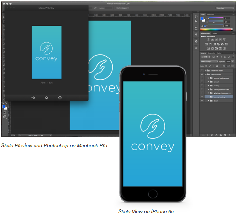
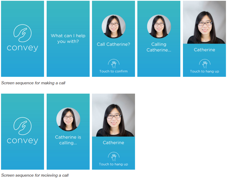
We wanted to create a UI that was easily visible and simple enough to use for someone in bed at a hospital. We decided to call our app Convey, as it served to convey a loved one's message from afar. A logo was designed to embody this through a hand reaching out and was colored blue, which is both soothing and reflects the hygienic nature of the medical field.
After exploring our options and constraints, we decided to create a user interface simulating an outgoing and incoming call. Simple diagrams aid the user in understanding how the touch interactions work, and are large enough for them view through the acrylic screen. During calls, a comforting image of their loved one is displayed.
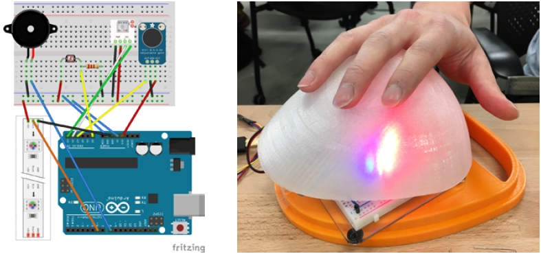
Since we were targeting patients in a pandemic situation, we wanted our prototype to provide clearly distinguishable states through audio and visual feedback. However, the feedback couldn't be too strong, or it would be distracting to the user. We decided to go with LEDs for visual feedback, while using a buzzer to provide audio feedback. It would be triggered by a light sensor, which was found to be the least obstrusive.
We decided to implement this using Arduino, due to the ease of use and cost of materials. We were able to buy all the required parts for less than $100, and were able to quickly rapid prototype using fritzing for the wiring diagram and arduino scripts such as pitches.sh. Several lighting schemes and patterns were tested to determine which sequence would work best with our UI.
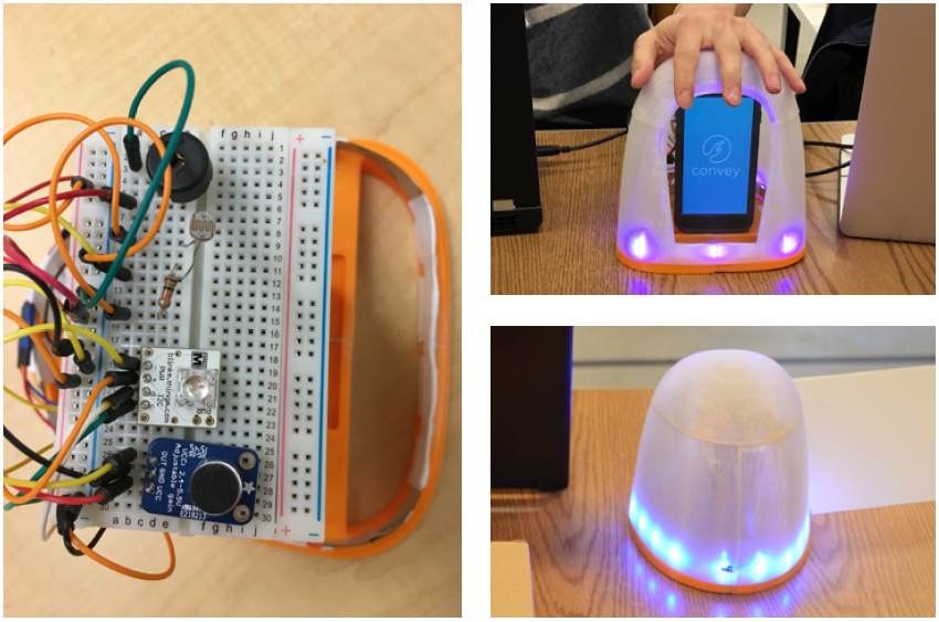
Throughout our protoyping process, we conducted informal tests with others to gauge the effectiveness of our prototype. The insights we gained from observing people interact with our prototype as well as the feedback they provided helped guide us on improvements for the next iteration, such as the led strip to provide a stronger visual cue, or playing a ringtone during an incoming call.
We evaluated our final prototype through Wizard of Oz testing. After giving users a brief overview of how Convey works, we gave them instructions for making a call. As the user interacted with the phone dock, we had someone sitting behind a laptop changing the screens accordingly. We then asked each person a short series of questions to learn what they liked and didn't liked about the experience.
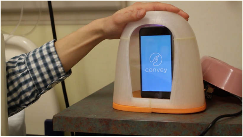
Our prototype was an effective test in demonstrating that a phone dock could be used to easily make and receive calls through voice and touch input. Through our user testing, we found that the form was ergonomic for people to touch as well as easy to use based on the simplicity of our UI. It took some users awhile to discover the touch input, but this could easily be remedied through extra visual cues at the top of the dock.
While our prototype was effective in demonstrating the basic interactions of the phone dock, we would probably need an addiitonal iteration integrating real-time voice interactions for a more complete behavorial prototype instead of using Wizard of Oz concepts before moving forward. After making these changes, we could move on to testing our prototype with patients in a real-life hospital setting.
